Click a link below to get started with our initial consultation.
Please upload the following files so we can get started on your project:
- Your logo (in SVG, PNG, or AI format if possible)
- Brand colors (hex codes or a screenshot of your style guide)
- Any fonts you use (or let us know the font names)
- Examples of existing marketing materials
What if I don't have everything?
No worries – upload whatever you have now. You can always add more files later, or we can work with you to develop what's missing.
You cannot upload files to a public portal.
Here are your latest design mockups. Download each file to review at full resolution.
How to give feedback:
- Download and review each design
- Note any changes you'd like using the feedback form below
- We'll schedule a review call to walk through everything together
Nothing here yet. Once files are added, they'll appear here.
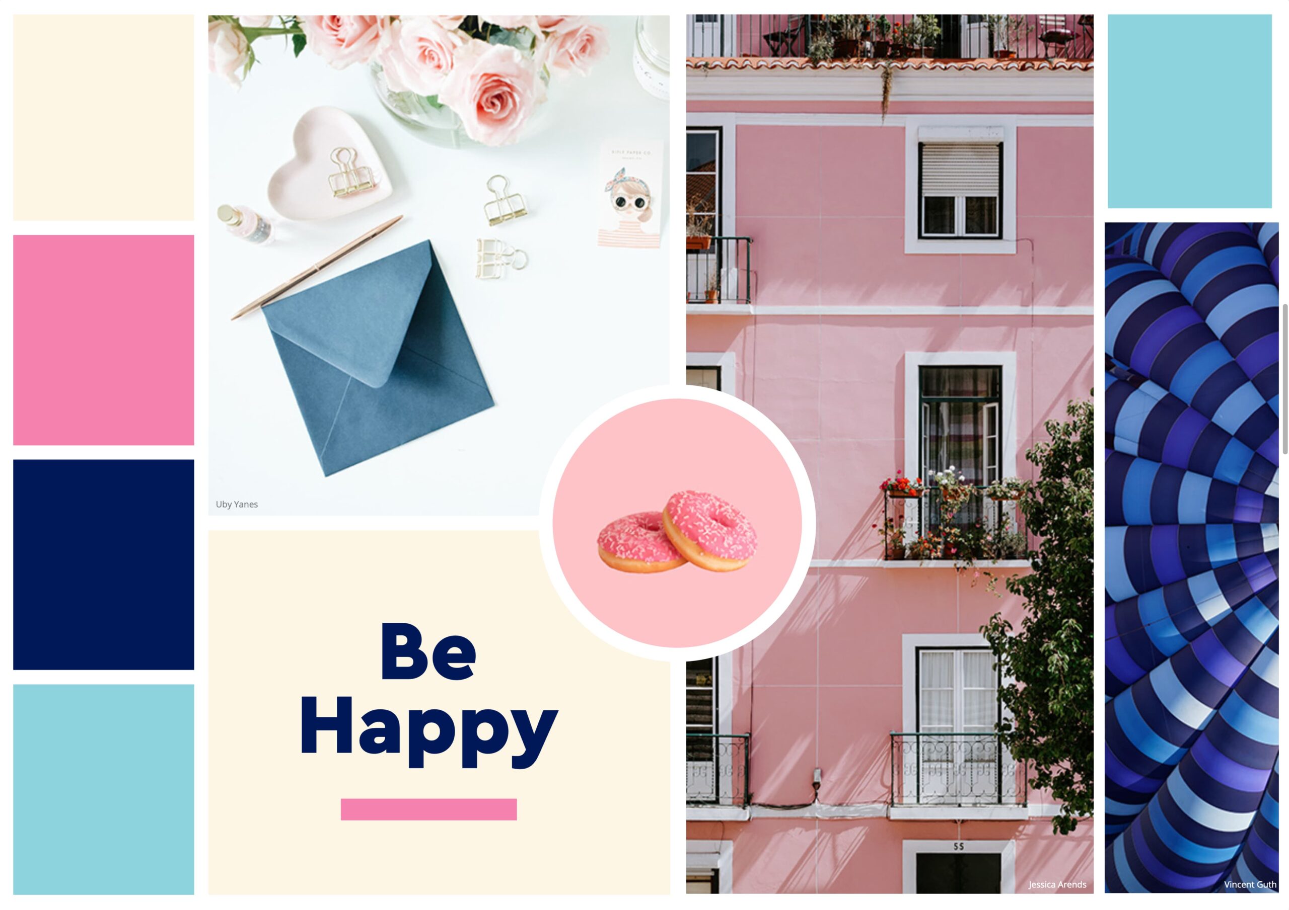
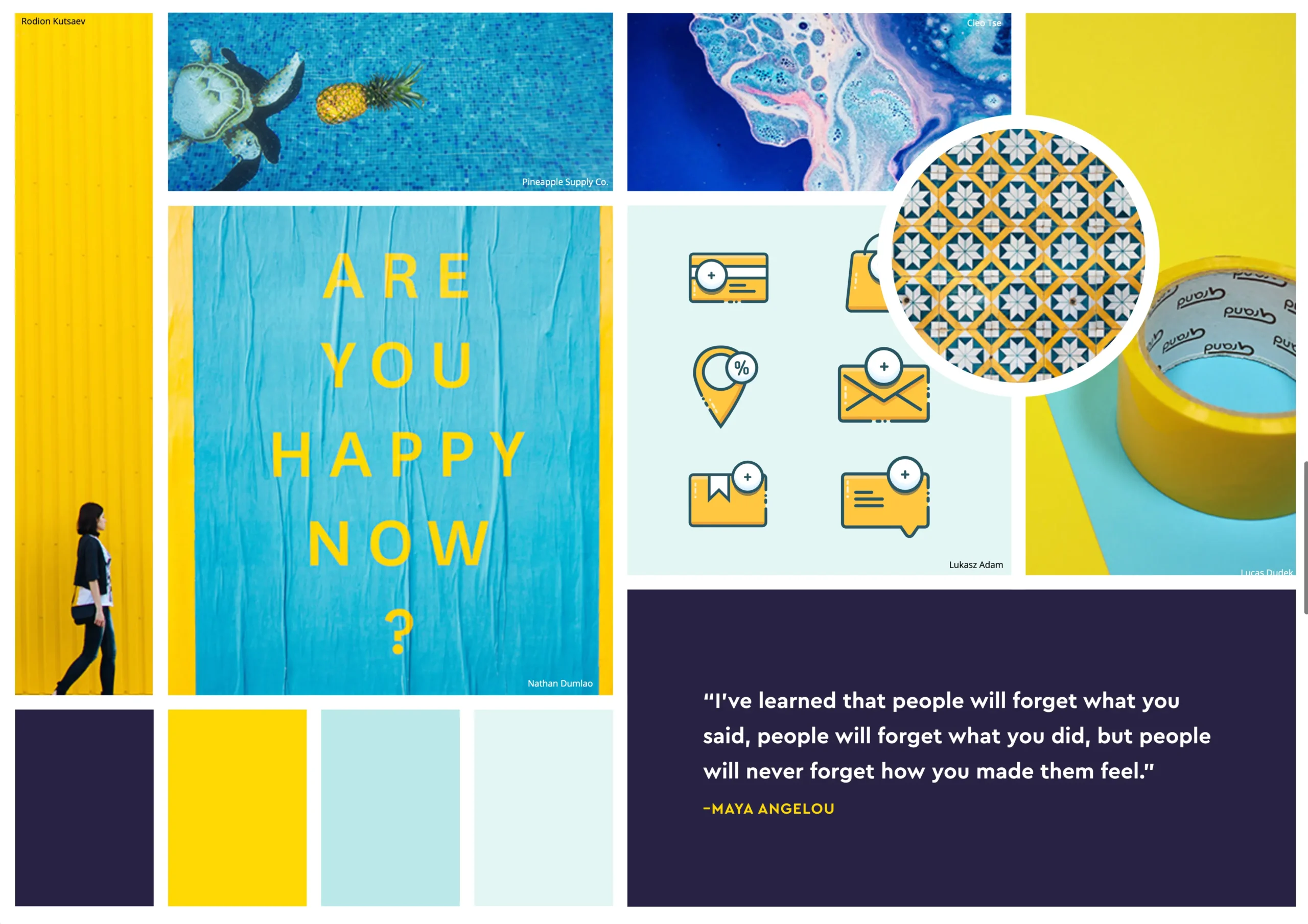
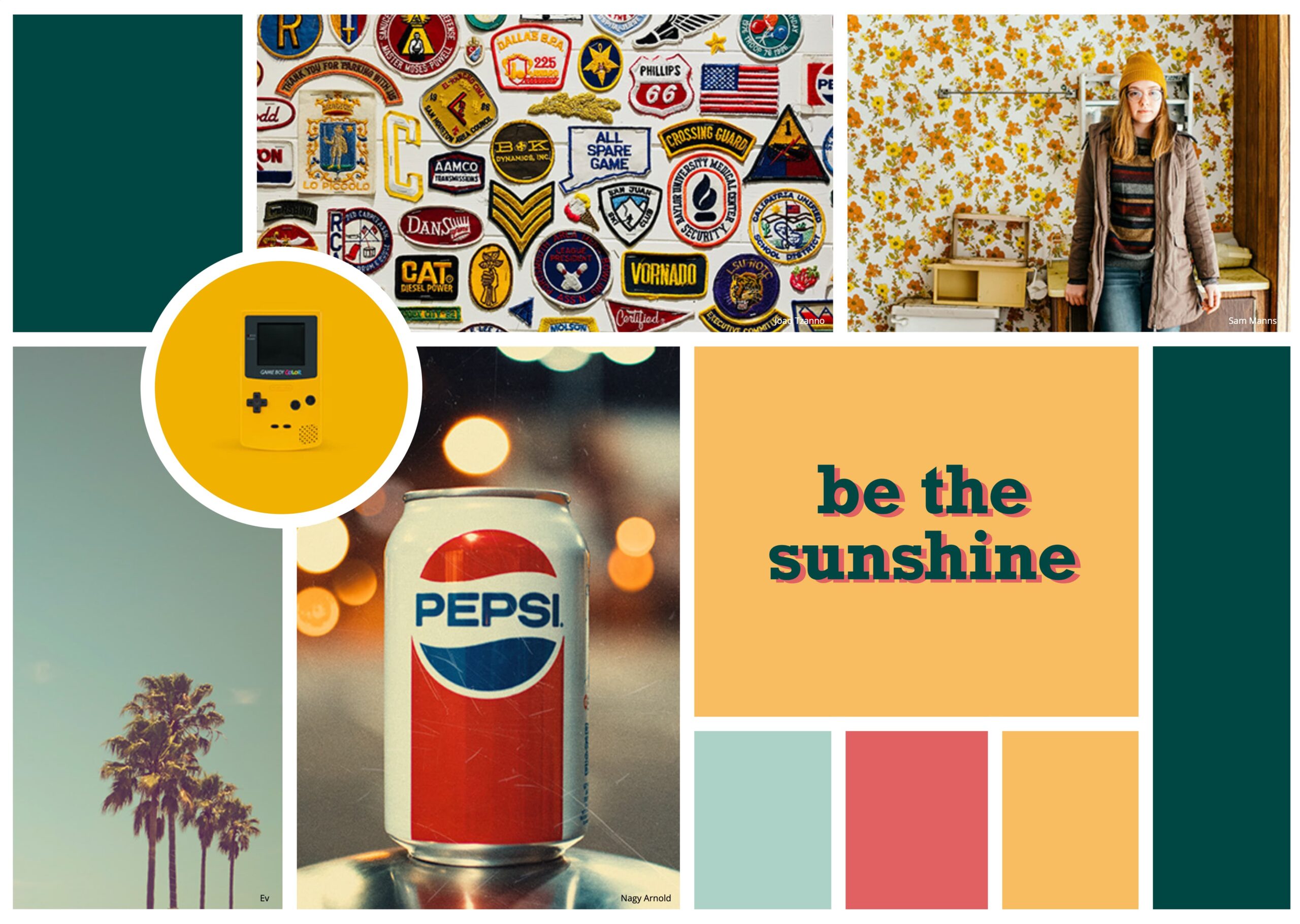
Browse through our initial design inspiration. These images capture the aesthetic direction we're exploring for your brand.
These reports cover the initial SEO audit and recommended optimizations. Key findings are highlighted in yellow within each document.
Your completed project files are ready to download. This package includes:
- Logo files in SVG, PNG, and PDF formats
- Brand style guide with colors, typography, and usage rules
- Social media templates sized for Instagram, Facebook, and LinkedIn
- Source files in Figma format
You cannot upload files to a public portal.
Need something updated on your site? Upload your request here with any relevant files.
After launch, we offer monthly maintenance plans to keep your site running smoothly. Your first month is complimentary!
Brand guidelines
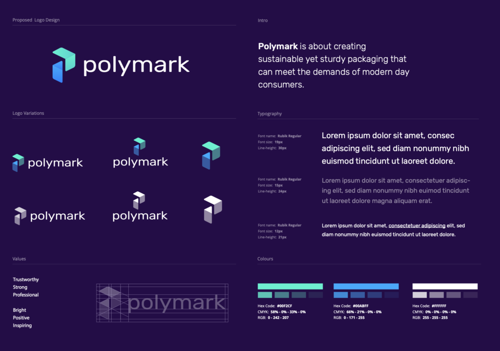
This document outlines the complete visual identity for Polymark’s brand refresh. Every detail -from typography to color -has been carefully considered to create a cohesive, memorable brand experience across all touchpoints.
Please review each section carefully and reach out if you have any questions or need clarification on any of the guidelines below.
Before you begin
These guidelines apply to all digital and print materials going forward. If you have existing materials that use the old branding, we recommend a phased transition over the next 3-6 months. We’re happy to help prioritize which materials to update first.
Design philosophy
Polymark’s refreshed identity is built on three principles: clarity, warmth, and confidence. Every design decision -from the open letterforms of our typeface to the balanced color palette -serves these principles.
Good design is as little design as possible. Less, but better – because it concentrates on the essential aspects, and the products are not burdened with non-essentials.
Dieter Rams
We’ve applied this thinking throughout: clean layouts with generous whitespace, a restrained color palette used with intention, and typography that’s readable before it’s decorative. The result is a brand that feels both polished and approachable.
Typography system
We’ve selected Inter as the primary typeface for its excellent readability across all screen sizes and weights. It’s a modern sans-serif designed specifically for screens, with a tall x-height and open letterforms that remain legible even at small sizes.
Headlines use semi-bold and bold weights to create clear visual hierarchy, while body copy uses regular weight for comfortable extended reading.
| Element | Font | Size | Weight | Usage |
|---|---|---|---|---|
| H1 -Page Title | Inter | 36px | 700 (Bold) | Main page headings, hero sections |
| H2 -Section | Inter | 28px | 600 (Semi-bold) | Major section dividers |
| H3 -Subsection | Inter | 22px | 600 (Semi-bold) | Content group headings |
| H4 -Label | Inter | 18px | 700 (Bold) | Card titles, sidebar headings |
| Body Copy | Inter | 16px | 400 (Regular) | Paragraphs, descriptions, lists |
| Small / Caption | Inter | 14px | 400 (Regular) | Footnotes, metadata, timestamps |
| Eyebrow | Inter | 12px | 700 (Bold) | Phase labels, category tags (ALL CAPS) |
| All sizes are base values -they scale responsively across breakpoints. | ||||
Typography is the voice of your brand. When used consistently, it creates an unmistakable identity that your audience will recognize instantly – even without seeing the logo.
Color palette
The refreshed palette balances professionalism with approachability. Each color has been tested across digital and print applications, and every combination meets accessibility standards for contrast.
Primary colors
These are the foundation of the brand. Polymark Green and Blue are the signature accent colors, while Polymark Purple grounds the palette and provides strong readability for text.
| Swatch | Name | Value | Usage |
|---|---|---|---|
| Polymark Green | #00F2CF | Primary brand accent, highlights, CTAs | |
| Polymark Blue | #00ABFF | Links, secondary buttons, interactive elements | |
| White | #FFFFFF | Page backgrounds, content areas, cards | |
| Polymark Purple | #260C49 | Body text, dark backgrounds, footer | |
| Polymark Violet | #5E556B | Secondary text, muted accents, subtle elements |
Accent & status colors
Accent colors add energy and communicate meaning. Use them sparingly for maximum impact -they should draw attention, not compete with the primary palette.
| Swatch | Name | Value | Usage |
|---|---|---|---|
| Coral | #F76187 | CTAs, highlights, key actions, sale tags | |
| Sage Green | #6DBE8C | Success states, approvals, positive indicators | |
| Amber | #EA8913 | Warnings, pending states, attention callouts | |
| Vermilion | #E14323 | Errors, destructive actions, urgent alerts |
Neutral palette
Neutrals provide structure and hierarchy. Use darker tones for primary content and progressively lighter tones for secondary elements, borders, and backgrounds.
| Swatch | Name | Value | Usage |
|---|---|---|---|
| Charcoal | #2C314C | Headings, primary text | |
| Slate | #6B6E7B | Secondary text, muted icons | |
| Warm Gray | #9CA3AF | Placeholder text, disabled states | |
| Silver | #C8D2D5 | Borders on hover, interactive dividers | |
| Cloud | #E7EAEC | Default borders, dividers, table lines | |
| Mist | #EEF2F5 | Secondary buttons, hover backgrounds | |
| Snow | #F8FAFB | Page backgrounds, alternating table rows |
Accessibility note
All color combinations in this palette meet WCAG 2.1 AA contrast requirements. Polymark Purple on white achieves excellent readability, and Polymark Green and Blue provide strong contrast as accent colors, and all status colors have been tested against their respective light backgrounds.
Logo usage
The Polymark logo is the most recognizable element of the brand. It exists in three approved variations: full color (primary), single color (for limited print), and reversed (for dark backgrounds). Always use the provided logo files -never attempt to recreate or modify the logo.
Clear space & minimum size
Always maintain adequate clear space around the logo. The minimum clear space is equal to the height of the “P” in Polymark on all sides. This ensures the logo maintains its visual impact and isn’t crowded by surrounding elements.
The logo should never appear smaller than 120px wide on screen or 1 inch wide in print. At smaller sizes, use the logomark (icon only) without the wordmark.
Common mistakes to avoid
- Do not place the logo on busy photographic backgrounds without a solid or semi-transparent container
- Do not change the logo colors outside of the three approved variations
- Do not add drop shadows, outlines, gradients, or any other effects to the logo
- Do not rotate, skew, or alter the logo proportions in any way
- Do not use the old logo on any new materials -the transition is immediate for new assets
Photography & imagery
Photography plays a key role in communicating the Polymark brand. All imagery should feel authentic, warm, and aspirational -never staged or overly corporate. Natural lighting is preferred, with a slight warm tone that complements the brand palette.


Every photograph should feel like a moment captured, not a scene directed. The viewer should feel invited into the frame, not sold to. Choose images that tell a story and evoke emotion over images that simply look polished.
Image guidelines
- Composition: Favor clean compositions with a clear focal point and plenty of negative space for text overlay when needed
- Color treatment: Lightly warm-tone images to align with the brand palette. Avoid heavy filters or dramatic color grading
- Subject matter: People working collaboratively, detail shots of quality craftsmanship, nature and organic textures, workspace environments
- Diversity: All imagery should represent a diverse range of people, settings, and contexts
Tone of voice
How we write is just as important as how we look. The Polymark voice should be confident but never arrogant, warm but never casual, and clear but never simplistic.
| We are | We are not |
|---|---|
| Confident and knowledgeable | Boastful or condescending |
| Warm and approachable | Overly casual or slangy |
| Clear and concise | Jargon-heavy or verbose |
| Helpful and proactive | Pushy or salesy |
| Thoughtful and considered | Impulsive or reactive |
Write as if you’re having a conversation with a smart friend – someone you respect. Be direct, be helpful, and don’t waste their time.
Implementation notes
The following sections provide specific guidance for implementing the brand across different channels and formats.
For web usage, always use SVG format for the logo to ensure crisp rendering at all screen sizes. The favicon should use the logomark only (without text) at 32×32px. Load the Inter font from Google Fonts or self-host for performance.
All brand colors are available as CSS custom properties. Use the variable names rather than hardcoding hex values to ensure consistency and easy future updates.
For print materials, use CMYK color values provided in the brand asset package. The minimum logo size for print is 1 inch wide. Always use the high-resolution PDF or EPS version of the logo to ensure sharp reproduction.
Paper stock should be uncoated for general collateral and lightly coated for photography-heavy pieces. The warm, tactile quality of uncoated paper reinforces the brand’s approachable personality.
Social media profile images should use the square logomark version on a white background. Cover images should follow the templates provided in the brand assets folder. Maintain consistent use of brand colors in all graphics and overlays.
Photo posts should follow the same photography guidelines above. Avoid heavy text overlays on images -if text is needed, use the provided story and post templates.
Email headers should use the full-color logo on white. Keep the design simple and scannable -email clients have limited CSS support, so rely on web-safe fallbacks (Arial or Helvetica in place of Inter).
Use Polymark Green for links and primary CTAs. Limit each email to one primary CTA button and use text links for secondary actions.
Brand assets
All approved brand assets -including logo files, color swatches, font files, templates, and photography -are available in the shared brand assets folder. This folder is kept up to date and is the single source of truth for all brand materials.
Need something custom?
If you need a brand element that isn’t covered in these guidelines -a new template, a color variation for a specific context, or an adaptation for a new medium -please reach out before creating anything new. Consistency is key, and we’re happy to help create approved additions to the brand system.